Web Pages with Personality
Here is my website frontpage in 2011:
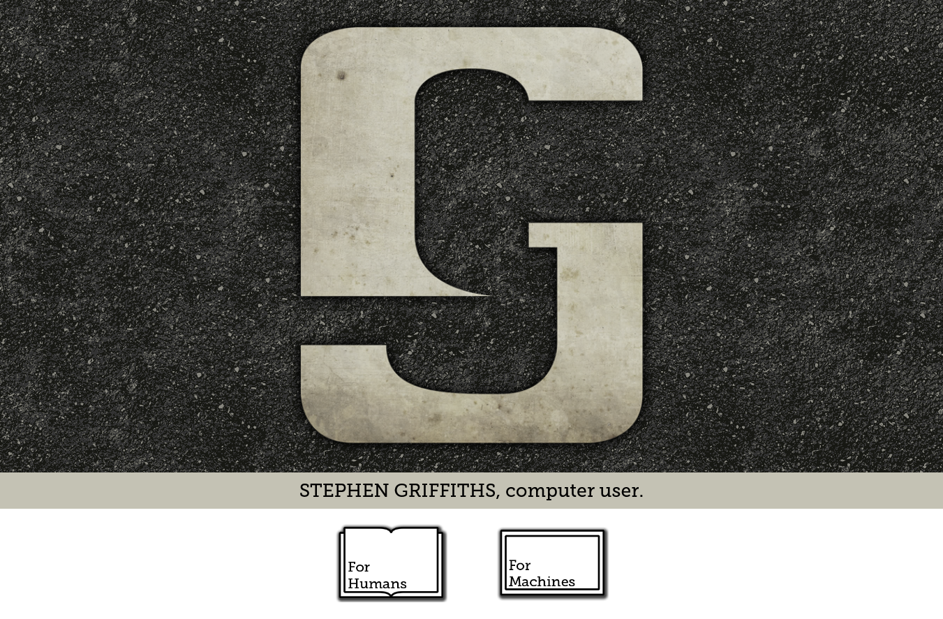
It features the earlier version of my SJG monogram, in a stressed concrete texture, with drop shadows galore. A tarmac background. Big slab serif fonts and two stark icon buttons.
Here is the mockup for my redesign in 2013:
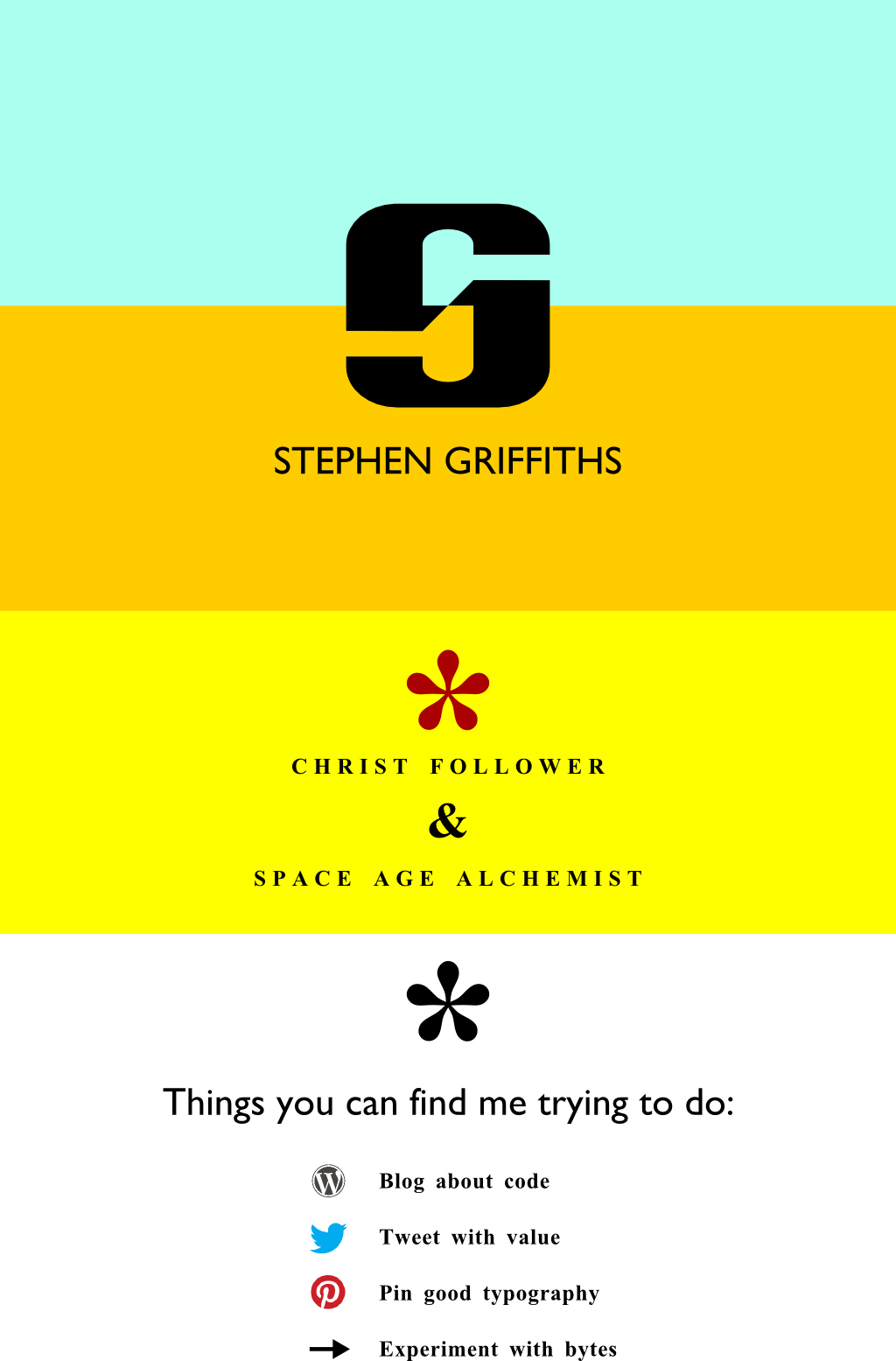
Bands of bright cyan, orange, and yellow. Big typographic elements in Gill Sans and Times New Roman, tracked wide like something from Printed Ephemera.
…and how the site ended up looking:
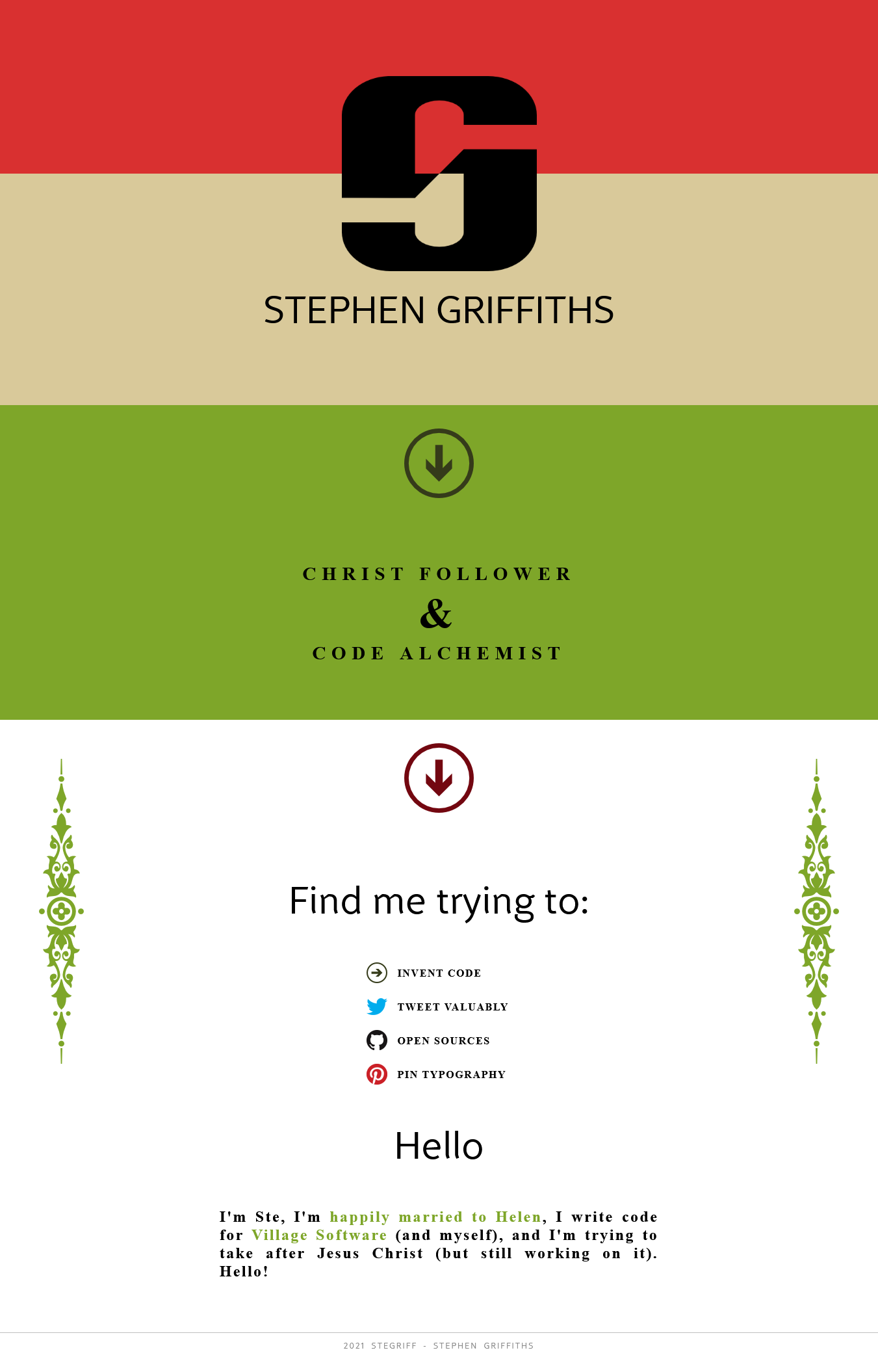
I went for a different pallette – strawberry, forest, and beige – can’t remember why. The design elements changed from asterisks to Windows-Phone-style arrows as a kind of UI affordance.
This is my site now (since about 2016? Can’t remember):
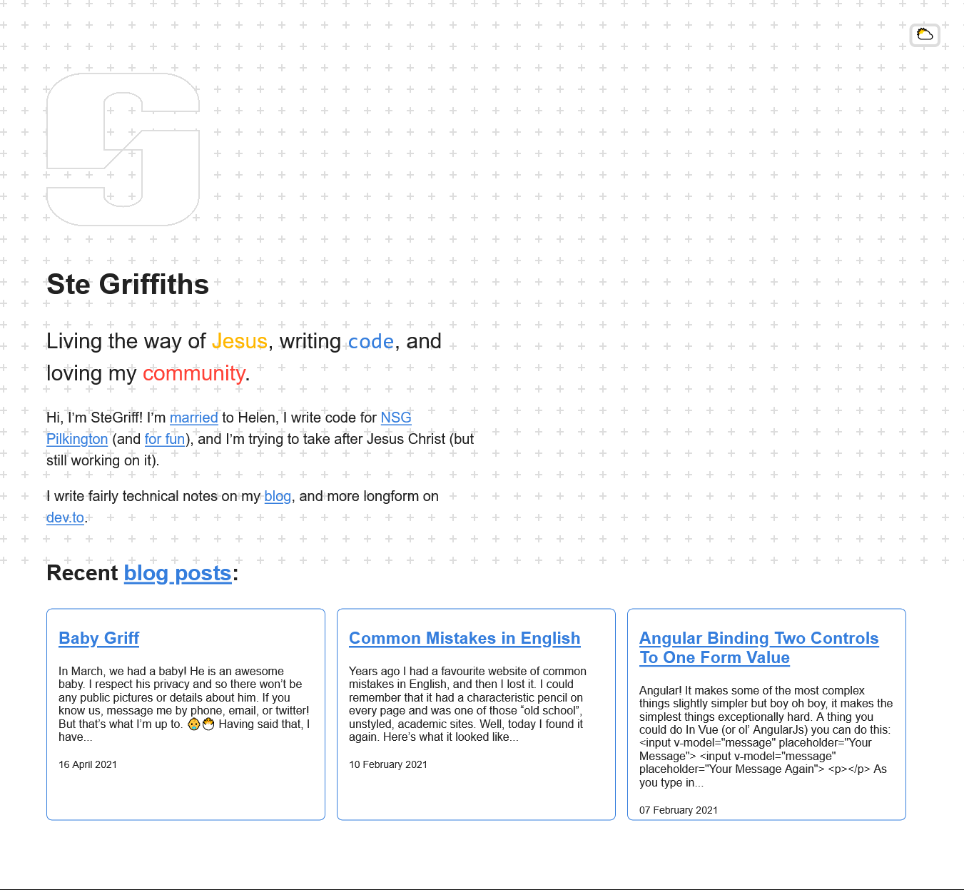
This was very much a bottom-up redesign rather than top-down; while 2013 was designed Inkscape-first, implementation later, this design was constrained by my choice to use Tacyhons and as little CSS as possible.
Now, I’m pretty obsessed with Tachyons and I still think it’s great. But in letting it dictate the design aesthetic here, I wonder how much personality the site has lost?
Inspiration
I’ve recently been inspired by Kinopio and more broadly by Pirijan and the people in his sphere of the creative web.
Have you ever seen https://www.kickscondor.com/??
Or the stuff that Kick’s and weiwei are doing by building multiverse?
It’s blowing my mind.
I can be creative, especially when I’m not at the computer. But our tools shape us!! Sharpies ain’t CSS!!
So I want to reconnect with my creative power and make this site into a garden city. Let’s get real. Let’s get redemptive…
Til next time 🌿🌄🚴