Embrace the case or don’t
Every few years, Microsoft refreshes its core productivity software suites like Office and Visual Studio to match whatever is going on with Windows at the time.
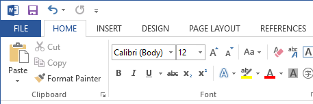
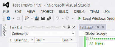
The corresponding releases for Windows 8 were Visual Studio 2012 and Office 2013. Both of these were devisive for one key design decision: uppercase menus.
A lot of people don’t like this, and the key issue is that uppercase text is thought to be more difficult to read than sentence-case text. And while this change wasn’t realistically going to slow anybody down as they worked, it did represent an actual usability regression. Usability really shouldn’t go backwards. On one side, people rallied behind the call “EMBRACE THE CASE!” and the other, there were easy registry hacks to put the text back in sentence case.
Now, I happen to be a fan of the upper case menus. I think they’re fun; bold and expressive. I know that Microsoft made the change to match the UI in Windows 8, of which I am also a rare supporter. I like uppercase titles for the odd thing, and it adds variety to a user interface without a great tradeoff on usability. I’d never put a body of text in uppercase, but one-word-headings are OK with me.
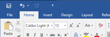
The key learning from this story is that in the end, Microsoft changed it back. They picked function over form – usability over design. And it’s kinda less fun. But it was probably the right call.